Friday, 6 May 2016
Thursday, 5 May 2016
Evaluation Question 4
How did you use media technologies in the
construction and research, planning and evaluation stages?
 As a group we discovered the impracticality of low cost digital recorder
cameras with the down sides being: low quality images (usually around 320p
resolution), short battery life spans and often awkward controls such as the
DXG series of camcorders. With the recent phenomenon of high quality camera
phones becoming widely available we decided to utilize the iPhone 6s+ which
boasts a 4K front camera.
As a group we discovered the impracticality of low cost digital recorder
cameras with the down sides being: low quality images (usually around 320p
resolution), short battery life spans and often awkward controls such as the
DXG series of camcorders. With the recent phenomenon of high quality camera
phones becoming widely available we decided to utilize the iPhone 6s+ which
boasts a 4K front camera.
Finding a way to steady the phone to
the quality of the camera on a tripod was at first a challenge after taking
initial shots free-hand, believing that
there wasn't an alternative. Although, the shots still made it
to the final cut of the video, taking them proved difficult and we worried
about maintaining a high level of quality for each take.
 Strangely, it was
a disdain for the selfie-stick fad that gave us an idea to use
the attachment phone-grip to hold the mobile and attach it to the tripod
with the hope that it would be compatible with a tripod. We bought a
selfie-stick and removed the phone attachment to find that it fits perfectly
within the tripod jack. This effectively saved our piece and enabled us to take
high quality shots with a steady foundation.
Strangely, it was
a disdain for the selfie-stick fad that gave us an idea to use
the attachment phone-grip to hold the mobile and attach it to the tripod
with the hope that it would be compatible with a tripod. We bought a
selfie-stick and removed the phone attachment to find that it fits perfectly
within the tripod jack. This effectively saved our piece and enabled us to take
high quality shots with a steady foundation. As we had chosen to use an iPhone to
take the shots we needed, rather than transfer the contents to a computer to
use more conventional software such as Sony Vegas, we used an application
called Splice that acts the same as the Apple own video software: iMovie. Using
this, it prevented us from spending large amounts of time transferring large
amounts of data which would have been a challenge in itself with email size
restrictions.
As we had chosen to use an iPhone to
take the shots we needed, rather than transfer the contents to a computer to
use more conventional software such as Sony Vegas, we used an application
called Splice that acts the same as the Apple own video software: iMovie. Using
this, it prevented us from spending large amounts of time transferring large
amounts of data which would have been a challenge in itself with email size
restrictions.
The sites we used were Blogger, for
all of our research and planning and YouTube to publish and embed videos. To
use Blogger, we needed to have a basic understanding of HTML 5 coding language,
which we used to embed links and focus on specific commands when creating
posts.
We used the WIX website builder to create our own website about the digipak which required us to use advanced YouTube settings to embed and link our video. Furthermore, we used Photoshop to create a still of our video to use as a back ground for the website and create synergy between our products.
Evaluation Question 3
What have you learned from your audience
feedback?
Whilst creating our music video, we believed that
audience feedback was paramount in creating an enjoyable and technically
proficient production. We approached audience feedback in a variety of ways
varying from a focus group evaluating our first draft to a survey discussing
genre conventions of music videos.
 Firstly, we received feedback on our
initial ideas which was a fantasy battle. We included our entire media studies
class in the survey leading to, roughly, eight completed surveys. The feedback
we received, both written and verbal, concluded that a fantasy battle will be
difficult to produce when factors of cost were considered. Also, a fantasy
battle would take too long to create due to the use of CGI and green-screen.
Consequently, as we have no knowledge in the field of green screen effects and
CGI we decided we were better off perfecting a simpler idea which was easier to
create. From audience feedback, we were able to manage our time in a more
productive manner. Furthermore, it allowed us to explore other aspects of the
fantasy genre such as a dystopia similar to that of the hunger games which is
what we ended up creating.
Firstly, we received feedback on our
initial ideas which was a fantasy battle. We included our entire media studies
class in the survey leading to, roughly, eight completed surveys. The feedback
we received, both written and verbal, concluded that a fantasy battle will be
difficult to produce when factors of cost were considered. Also, a fantasy
battle would take too long to create due to the use of CGI and green-screen.
Consequently, as we have no knowledge in the field of green screen effects and
CGI we decided we were better off perfecting a simpler idea which was easier to
create. From audience feedback, we were able to manage our time in a more
productive manner. Furthermore, it allowed us to explore other aspects of the
fantasy genre such as a dystopia similar to that of the hunger games which is
what we ended up creating.
Secondly, after we completed our
first draft, we requested verbal feedback from a few people in our class. The
first draft consisted of a 50 second clip, the introduction of our video, we
decided it would be wise to receive feedback on this section alone due to the
fact that it would set the mood and pacing of our entire video. The general
consensus was that we were on the right lines with the mood and tone of the
video being quite gritty and depressive which was what we were aiming for,
however the fact that we were trying to convey a dream-like atmosphere, as our
genre is dream pop, didn't translate to our audience which was one aspect to
improve. Another aspect our audience suggested we improve was the timing of
shots in relation to the music. They believed that most shots should be in time
with the drum beat which we completely agreed with and rectified this in our
second draft - including all other concerns they raised with us making audience
feedback paramount to the improvement of our music video.

Finally, after improving our first
draft we decided to show a different group. Our second draft, consisted of the
recommended improvements from our first group, yet, also included various
additions such as filters, new transitions and new shots. The general consensus
was positive, however the shots were still out of sync to the music which was
our main concern with our final draft. We decided to redraft our entire video,
because of this. making our audience feedback crucial to this process.
In conclusion, audience feedback was by far one of the most important
aspects of the improvement of our production. Not only did it allow us to view
our video from others perspectives and gain information that way, but it became
clear that there were issue with timing and our videos in relation to the dream
pop genre as a whole. Furthermore, the improvements to the music videos have
been invaluable to this process.
Evaluation Question 2
How effective is the combination of your
main product and ancillary texts?
 For our music video, we decided to focus on some key features from the original video and use them in our own product as a reference to the original work. This is why we decided to set ours in a forest area as we believed it conveyed the correct mysterious theme that is a convention of the dream pop genre. We also believed it would make the most sense whilst referring to the story in our music video, a man chasing down another with a bow and arrow.
However, we decided to change our filter and overall theme of the video changing the entire meaning of the song in the process. The original works is demonstrating the protagonist of the video as a victim whilst they regain their power, however, ours describes the wolf as an assassin in some sense, the representation of the wolf is changed to someone stalking and hunting their target or prey. In relation to our other ancillary texts such as the Digipak, we have focused on the imagery of the wolf to present our piece. This makes the combination of our Digipak and Song extremely effective as it depicts a wolf in a delicate pattern - noticing the vulnerability of the lyrics and the powerful imagery of the wolf.
We believed that this would be most beneficial to the overall storyline of our video and allow us to keep certain genre conventions such as a disjointed narrative within our production.
 Furthermore, our music video was inspired by other media texts such as the hunger games. Our protagonist of the video was heavily inspired by the protagonist of hunger games, Katniss Everdeen. This is why we opted to use a bow instead of a gun as we believed it would present a much more rustic, dystopia theme. We presented this in our website with it having an ethereal theme with white and black colours taking priority and any photographs being washed out and faded. We believed that this design would be most appropriate when taking into consideration that the website is for the dream pop genre. It is also why the choices in font were rather gentile rather than bold font as it is indicative of the genre. We have also taken inspiration from the alternative genre to convey our website as dream-pop and alternative are extremely similar in stylistic choices which is why we believe the website and video combine perfectly.
What also became apparent was the use of modern clothing. We believed a fantasy (Our original idea) would not suit the lyrics in the music video, yet, we wanted to continue using the bow and arrow hence the dystopia a feel, as if the world were lost in nature. Katniss Everdeen embodied everything we wanted in our video as she is a strong character who holds traits that could be linked to a wolf such as her skill at hunting. We showed this in our Digipak also. The inclusion of the wolf on our front cover was supposed to emphasise the wolf as the primary aspect of our video showing that the combination of all of these emphasised the meaning and icons in our production.

We also believed that a lighter filter to our video would suit it much more as it includes fast paced shots and various match on action shots that are not featured in the original work. The original focused heavily on close-up shots and slow-mo which is why we decided to set ourselves apart to avoid falling into the trap of being too similar to the original product. Also, it would make much moire sense in our video as it is faster in shot speed and camera movement. The lack of slow-mo is another contributing factor as to why we did not include similar shots. The fact that we instead decided to speed up certain sections of our video meant the further away the person or object was away from the camera meant that the shot could continue for longer.
 In the dream pop genre, there is usually a recurring object that appears in the video. For Phildel's version of the video, she focused on a twig which was uniquely shaped and it appeared in different art such as her album cover and EP CD disc. Our group chose to focus on a bow and arrow for our object. This worked well for us as the bow and arrow would have been in the video regardless, but with the inclusion of an object being the convention of a dream pop video we decided to include more close ups of the bow and arrow rather than it just being a prop, this makes it one of the most notable features of the video which was intentional.
 In terms of ancillary texts, our website and Digipak follow a very similar design of mainly washed out colours being the theme, however when something is required to stand out more noticeable vibrant colours will be used which is inspired by Phildel's original artwork that she uses in her music albums. There is also similarities in the clear genre conventions we have used such as gentile thin fonts rather than harsh, bold fonts that would usually be used in a house music genre. We have also followed the convention of the imagery of animals and wildlife in the dream-pop genre, also, inspired by Phildel and other dream pop artists.
Our video and digipak demonstrate clear imagery of wildlife. The protagonist being representative of the wolf that is mentioned in the song bringing an almost literal meaning to a metaphor within the song, whilst on the album cover, imagery of wildlife such as flowers and most notably a wolf has clear direct links to our music video making the combination of the two extremely effective when presenting this.

Evaluation Question 1
In
what
ways does your media product use, develop or challenge forms and conventions of
real media products? (MUSIC VIDEO)

 The narrative of the music video is purposefully disjointed as are all music videos in the dream pop genre. This makes it so the lyrics and the music video relate and are in beat but there is a hidden meaning to the song as well as a hidden narrative. In our video, the narrative is representative of the song. A wolf trying to catch its prey, yet, the wolf being the victim in a way.
We didn't include titles in our piece as it was only a feature indicative of a high budget production similar to a film - an example of this would be Taylor Swift - Bad Blood. However, the average dream-pop music video would not contain any titles which is why we decided to follow the codes and conventions and follow.
The setting is also inspired off the original work - Phildel - The Wolf. We believed that a forest setting would make sense in a dream pop video due to the fact that it presented the most mystery out of all of the locations possible. There is also a large amount of foliage surrounding the area we live making it easy to film at allowing us to improve or edit more frequently if needed be.
For costume, we needed something that looked almost dystopian yet still familiar, which is why we decided on our own clothes. The alternative was a fantasy clothing/costume style, however, we didn't believe that this suited the lyrics of the song. We wore very washed out colours with nothing too vibrant so the mood came across as quite depressed and sad without using a black and white filter in order to not copy the original text. The protagonist is wearing a grey top similar to that of a grey wolf, we have done this so it is obvious that he is the primary character. The secondary character is wearing inconspicuous clothing to not make him stand out which is why he is wearing a black jumper with a hood.
Our frames were rather distanced from the original product as our shots are much more faster than the original video. This allowed us to add additional effects and transitions such as motion blurs and fast forwards which, yet again, is a code/convention for the genre.
 The narrative of the music video is purposefully disjointed as are all music videos in the dream pop genre. This makes it so the lyrics and the music video relate and are in beat but there is a hidden meaning to the song as well as a hidden narrative. In our video, the narrative is representative of the song. A wolf trying to catch its prey, yet, the wolf being the victim in a way.
Our characters are based of general pop-culture references. Our main character shows a strong protagonist similar to that of the hunger games, whilst our secondary character wears clothing to make him unnoticeable. We based it off a common medieval thief that you would see in a television show similar to Game of Thrones.
We made a point to ensure that the music would flow with the visuals: making it far faster paced during climaxes within the music. This ensures that the video is not disjointed to the music itself rather than the lyrics which can be seen as symbolic in nature on their own. Considering the context of the writer and the relation to the original music video by Phildel (Decca Records) we felt it be best if we engaged with the rhythm rather than words. To this effect, the video had an aspect of fluidity rather than what could be awkward cuts and visuals relating to specific phrases.


Digipak in Photoshop
Photoshop used for creating end product:

For the digipak, I painted a wolf using watercolours and scanned it into the computer. After that I manipulated the image using photo editing software.
Wednesday, 4 May 2016

'Cry Baby' Music Video Analysis
'Cry Baby' Music Video Anlaysis
 |
| Screenshots of the beginning of video to establish story. |
 |
| Picture of Melanie as Cry Baby. |
 |
| Scene where Cry Baby is attacked by her toys. It is possible that the toys could represent the people who have bullied her and made her cry. |
Scenes such as when Cry Baby spells 'FUCK' with the alphabet blocks or when she holds a real brain/heart to coincide with the lyrics: 'You seem to replace your brain with your heart' add a maturere/disturbing feel to the music video to contrast with the baby aesthetics (showing consistency in Melanie's ceative star image). The
The following video in the story arch is Dollhouse which is why Cry Baby's tears flood the metaphorical dollhouse in the final scene.
 |
| By using a realistic brain and a realistic heart adds an element of gore to the music video. |
 |
| 'FUCK' written with alphabet blocks. |
 |
| Cry Baby's tears flood her house. |
Tuesday, 26 April 2016
Behind The Scenes
Behind The Scenes (BTS)
'Behind The Scenes' refers to the creative process that goes into creating form of media which is out of the sight of the public. 'Behind The Scenes Videos' are a fairly recent idea which song artists are beginning to adopt. By doing this, they are able to promote their music video which reinforces the hype associated with the release of the video for their fan-base. Furthermore, it allows for an 'inside' look into the creative process to inspire fans and keep up the idea of retaining a 'star image'. There is usually a director who co-ordinates what the song artist should so (just like filming a movie). In some cases (especially when the star image of an artist is to be artistic/creative/personal), then they may direct the video themselves.
BTS of The 'Cry Baby' Music Video by Melanie Martinez:
(Note: Melanie Martinez also directed this music video)
Friday, 22 April 2016
Props & Costumes
Props & Costumes
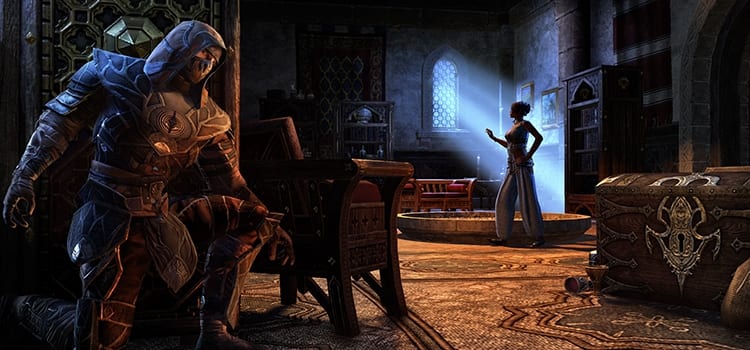
For the assassin (portrayed by me) we purchased a wooden bow & arrow from Amazon. Because our video idea is going have dystopian influence for the visuals (fantasy as a more sub-genre), our props are not going to in a large quantity. Our costumes are also going to be clothes that are already in a wardrobe.
Thursday, 10 March 2016
Music Labels
 Music Label or Record Label
A record label is a brand or trademark associated with the marketing of music recordings and music videos. Often, a record label is also a publishing company that manages such brands and trademarks, coordinates the production, manufacture, distribution, marketing, promotion, and enforcement of copyright for sound recordings and music videos; conducts talent scouting and development of new artists ("artists and repertoire" or "A&R"); and maintains contracts with recording artists and their managers. The term "record label" derives from the circular label in the centred of a vinyl records which prominently displays the manufacturer's name, along with other information.
Examples of music labels: Atlantic Records, Young Money, Def Jam, Columbia Record are just a few mainstream record labels who have signed popular mainstream song artists such s Nicki Minaj, Beyonce, Rhianna.
Thursday, 3 March 2016
Star Image in Music Videos
Star Image in Music Videos

Richard Dyer: Star Theory:
"Pop performer" and "pop star" are not the same.
Pop stars have an identity or persona which is not solely to their musicianship. A true pop star has "brand awareness" amongst a wider market over a period time.
Star's image:
A star's image becomes a readily recognised sign that is used in many different media forms. Stars can use the fact that their image has meaning by allowing it to be used for advertising purposes. A pop star is a manufactured image and does not correlate to person's personality behind the image.
Star's influence onto target audience:
Stars are made to appeal to a specific target audience to generate revenue for record companies. Record companies tend to nurture and shape their stars into an image which they deem to be desired by their demo-graph (hence the almost carbon copied image aligned with boy bands).
Culture:
Stars represent a shared culture due to the globalisation of media. When audiences display interest in a star's values/opinions then this further enhances their "star quality".
Character:
A star often begins as what the media portrays as a "real" human which may result in the transformation process turning them into a construct. Sometimes caricatures/personas are created to make the star stand out from competitors (example: Nicki Minaj had several alter egos to breach the mainstream pop audience before reverting back to her hip hop roots which has inevitably made her the most successful female rapper in history).
Thursday, 21 January 2016
Phildel's Digipaks

Analyses of Phildel's existing Digipaks:
Since our chosen artist is Phildel, I thought it'd be best to investigate the codes and conventions of a typical Phildel album cover.
Considering there are only 4 collections, the conventions are relatively clear.
With the anomalous 'Qi' not featuring Phildel, herself and diverging from the typical plain colours of the background in favour of a more ancient look, gives us breathing room creatively.
The typical logo for Phildel is simply her name in thin lettering spaced out or squashed depending on the placement of the central image of the album design.
Noting that we have to use only original material and focusing on the song 'The Wolf' we are currently set on basing the cover of our digipak on said animal. My personal view is that we use 'Qi' as a style model for our work: minimalistic in design yet remaining true to the dream-pop form of being somewhat ethereal.
A clear nature theme is throughout all of the albums with each containing some form of either bird or tree homage. This could benefit us as we may integrate this into our wolf themes cover perhaps featuring a forest environment while remaining as minimalistic as possible. Furthermore, with the exception of 'The Glass Ghost', the tones of the covers have been all relatively earthy, boasting shades of brown to compliment the naturalistic theme.
Digipak Conventions
Digipak Research
What is on the front cover of album?:
Artwork that is synonymous with the artist. This may include:
- Photo of song artist.
- Colours that have been socially "trademarked" by the song artist (For example - Nicki Minaj's albums follow a cohesive theme of pink - The Pinkprint, Pink Friday, Pink Friday: Roman Reloaded).
- Artwork that symbolises the theme of the album.
- Parental Advisory logo if lyrical content may be considered "inappropriate" for children.
- Title of album
What is inside inside a digipak?:
The main content in a digipak is the CD. It can also include:
- Song lyrics.
- Artwork that was conceptual designs for the front cover.
- CD is often patterned or decorated with a theme similar to front cover.
What is on the back cover of album?:
Track listings are the most obvious convention of a back cover. Others include:
- Track listing
- Bar-code.
- Record label
Soap/Training Wheels Collaboration (Melanie Martinez)
Video Analysis of "Soap/Training Wheels Collaboration" (Melanie Martinez)
The visuals of the music video illustrates a cohesive narrative that is connected to the album.
Soap:

"Soap" starts out by showing Melanie (in this case portraying Cry Baby) sitting in a bath tub talking on the phone. She invites a boy called Jonny to come round to her house. To which, he agrees.
There is an extreme close up to establish the scene of Cry Baby's hand submerged in water. Whilst talking on the phone, shots cut to yet another extreme close up of Cry Baby's face to conceal the top half of her face. A lullaby-esque tune is being played alongside the sound of dripping water. The conventions of this suggest a darker/creepy undertone to the feel of the music video which foreshadows the theme of the rest of the video. The use of key lighting further reinforces the creepy theme of the video in a shabby 1960's themed corridor.
Melanie's hair is coloured with one side being pink whilst the other side is black. The theme of the Cry Baby album uses childish subjects to convey darker/mature matters. Because of this, her choice of hair colour illustrates the conventional use of pink (which symbolises innocence) and black (which is commonly associated with darkness and evil) to convey the meaning behind the album. Furthermore, her outfit is made up of a bib and pink shorts (to symbolise a nappy) which is universally known as being associated with babies. As a result, manipulating the idea that this song is illustrating that Cry Baby is meant to be a young character.
As the music video progresses, more supernatural occurrences become prominent. For example, the tap mysteriously turns on to fill the bath, candles begin flickering and curtains begin moving. An old fashioned TV turns on - revealing snippets of Melanie's previous visuals of "Soap" which was originally released several months before this one.
 |
| Cry Baby (Melanie Martinez) aesthetic in Soap. The vintage visuals of her costume & floral background to show a cohesive theme of old-fashioned/modern hybrid throughout her videos. This helps to make her story telling through her album/music video to appear more professional and remain her style. |
Training Wheels:
Follows the relationship stage between Cry Baby & Johnny which was established in "Soap". The overall visuals of "Training Wheels" follow conventional romance themes such as holding hands, flowers, two-shot camera angles, bright lighting and playful body language. "Training Wheels" symbolises the bike's training wheels as a metaphor for a relationship. To communicate this in the video, two separate scenes transition between one another: Cry Baby teaching Johnny to ride a bike without the need for training wheels and a literal visual of Cry Baby and Johnny doing couples/relationship activities.
The visuals for this music video is a marginally less dark/creepy than "Soap"; to keep the close link between the two songs apparent, things such as the large eyes to represent falling in love are kept in both songs. Interestingly, "Soap" depicts Cry Baby as creepily appearing then disappearing in the bath tub before sharing a kiss with Johnny (which then leads to the giant "love" eyes). However, in "Training Wheels" it is Johnny who disappears as he is riding towards Cry Baby after learning to ride the bike which results in Cry Baby "love" eyes returning back to normal as he has abandoned her. "Soap" follows a creepy visual to illustrate the idea of the fear of saying something you probably shouldn't have (in Cry Baby's case, telling Johnny that her mum killed her dad and that she loves him). On the other hand, "Training Wheels" (being the only romance/love song on the album) conveys the the idea of love can result in sadness. As a result, both videos are able to keep within the theme of the album to show child-like subjects with mature meanings.
 |
| Cry Baby (Melanie Martinez) costume for "Training Wheels". Pink flower crown symbolises the romance theme of the song. |
Thursday, 14 January 2016
Songs Are Often Used For TV Shows & Movie Trailers
Often, existing songs are used for upcoming television shows or movies as they suit the theme of the story arch. Here is an example of Melanie Martinez's "Carousel" being used for the hit TV show "American Horror Story: Freakshow" trailer:
This is a good example of how to recreate an existing music video whilst retaing creativity & the cohesive themes of a song artist's style.
Original Melanie Martinez "Carousel"music video:
American Horror Story: Freakshow trailer:
This is a good example of how to recreate an existing music video whilst retaing creativity & the cohesive themes of a song artist's style.
Tuesday, 12 January 2016
Existing A2 Media Studies Music Video
A Different A2 Media Studies Student's Music Video
This idea essentially follows the same premise. A chase of some sort across a field or through a forest or some people having fun around town and getting into trouble.
The video will be light-hearted. Colourful and fun. This will not have a serious undertone.
Another idea I have been considering is people playing around and throwing water balloons then one accidentally miss fires and hits someone. This then leads to the person being angry and chasing the people with the balloons. The entire video will show the chase in a humorous way inspired by this video:
We could also be inspired by this video and show a robbery and a policeman attempting to get it back. Following this, I believe the idea of two people angering another and leading to a chase would be a great idea for the video and be entertaining to create.
Subscribe to:
Posts (Atom)